I knew I wanted something that reflected the fact that I am Irish, but I did not want to go down the obvious route of shamrocks, green everything and the usual clichés.
For those who know me, I am very proud of being Irish, and I have always had a real interest in ancient and medieval history. Irish manuscripts, old lettering, knotwork and the level of detail in those designs have always fascinated me.
So that became the starting point.
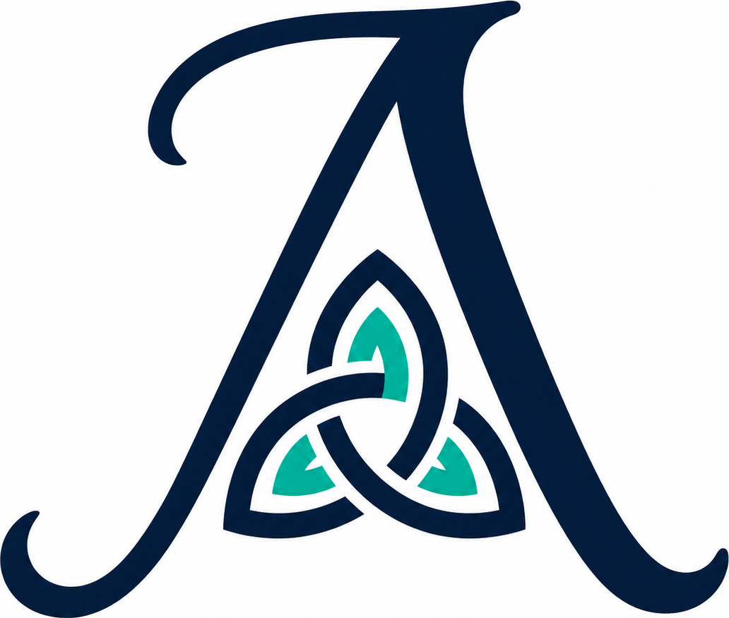
The logo is built around the letter A, for A Bit of This and That.
Inside the A is a knot.
And the knot is really the important bit.
A lot of what I do is about bridging the gap.
Bridging the gap between technical specialists and senior executives.
Between what happens on the event floor and what gets discussed in the boardroom.
Between the art of the possible and what is actually feasible today.
Between what a company thinks it is saying and what the outside world is actually hearing.
That is where I tend to sit.
I move between different people, technologies, industries and conversations, ask questions, challenge assumptions and try to help everyone make a bit more sense of what is going on.
There is also an element of joining the dots.
What I see at events feeds into my advisory work. The advisory work helps me ask better questions when I am interviewing people or looking at new technology. Those conversations then lead to new ideas, new connections and usually another rabbit hole to disappear down.
So the different strands are always feeding into one another.
So, for me, the knot represents bridging the gaps.
Not some grand mystical meaning.
Just the reality that most of my work involves connecting things that are not always naturally connected, helping people understand one another and bridging the gap between technology, business and what happens next.
So, after eight years, I finally had a logo.
An A for A Bit of This and That.
A nod to Irish manuscript design.
And a knot in the middle that represents what I seem to spend most of my time doing:
bridging the gap.